Last week, I was in Columbia, SC visiting one of my favorite stores, Manifest Discs and Tapes (for those of y’all that love all things pop culture and live in the Columbia area, or if you’re located in Charlotte, NC or Charleston, SC; go to this store!). While I was there, I came across something that made my entire day…they had Mr. Bowie’s earliest albums on vinyl! Vinyl, doggone it! I spent a good 10 minutes just salivating over those legendary records. Too bad I didn’t have any money!
However, looking at the albums gave me inspiration for another Top 10 list. At first, I decided on doing a Top 10 of Mr. Bowie’s greatest albums. Then I realized that I’ve only listened to ten of Mr. Bowie’s albums (don’t judge me, the man had a 50 year career and 28 albums! I haven’t gotten around to all of them yet!). However, I have seen all of the covers for the albums, and truth be told, Mr. Bowie’s album covers themselves have changed the face of pop culture. So, I decided to make a top 10 of Mr. Bowie’s best album covers! Shall we begin?
10. “Heroes”
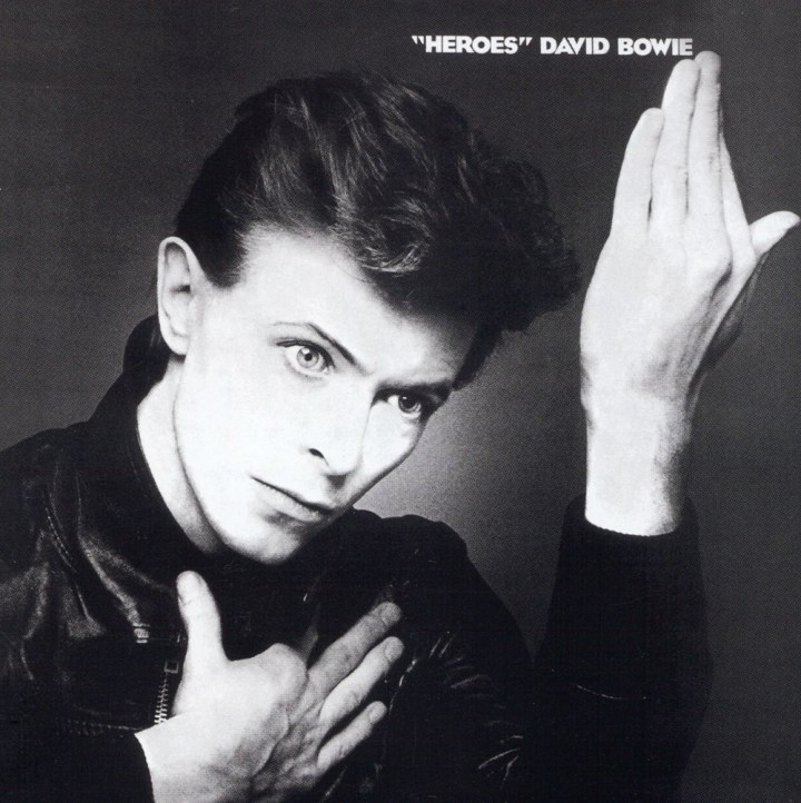
It’s always been something about the “Heroes” cover that’s been eye catching to myself and so many other fans, but I’ve never been able to put my finger on it. Maybe it’s the pose, which according to the legend himself, was inspired by the painting Roquairol (as was Iggy Pop’s The Idiot, which was produced by Mr. Bowie and also released in 1977). Or maybe it’s the fact that Mr. Bowie had debuted his new “Berlin Bowie” look on the cover (he officially changed his look when he did the Low album, but that album cover still featured his Thin White Duke persona). Either way, this has been one of my favorite covers. Mr. Bowie must’ve loved it too, considering that he recreated it for his 2013 album, The Next Day.
9. Lodger
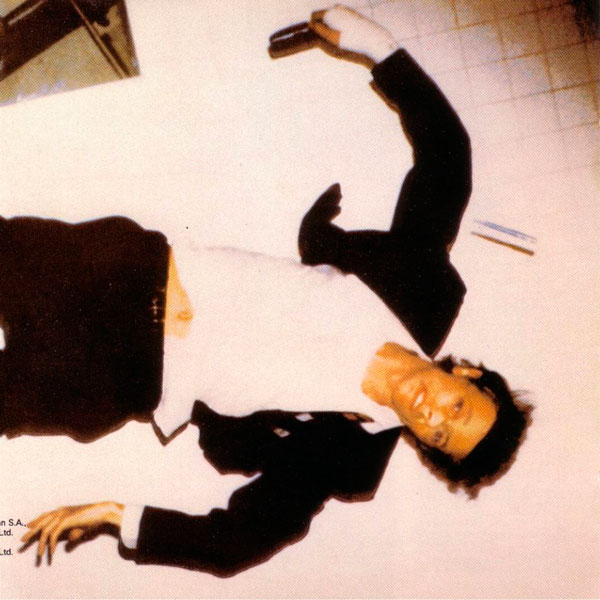
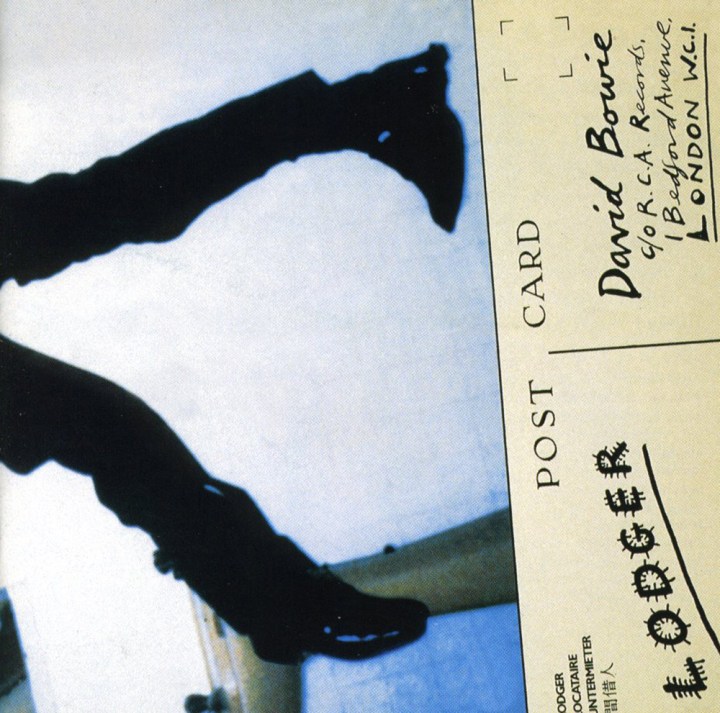
Mr. Bowie is barely recognizable on the cover of this album. For the longest time, I didn’t even think it was him until I came across the behind the scenes photos. Basically, the artwork shows an accident victim in a bathroom, whose picture is taken with what may very well be a Polaroid camera (are there any 80’s babies in the house that remember those? I LOVED those things!). His nose is completely busted, hence the reason I didn’t recognize him. The bottom half of the album shows Mr. Bowie’s distorted legs with his feet pointing inward (it was a gatefold cover; you know, when you unfold the album to reveal the entire picture…once again, something only folks born before 1989 know about). This cover was damn ballsy.
8. Earthling
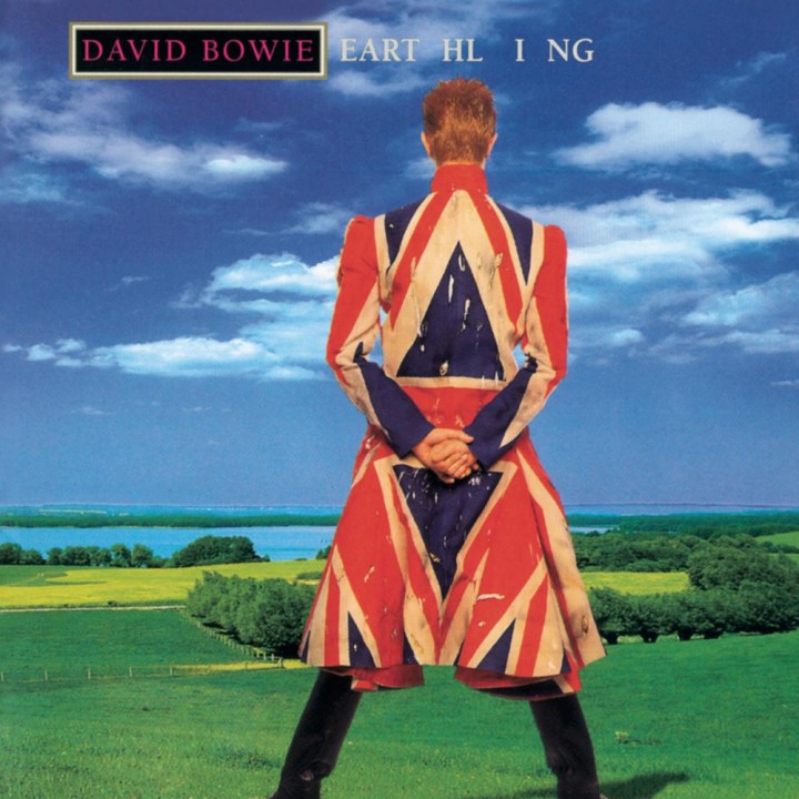
I’ll be honest, I never cared for Mr. Bowie’s Earthling era look. No disrespect, but he was a little too mature for the spiky red hair after a while. Please don’t get me started on that mohawk he sported for a minute during this era. Despite all that, I always liked the Earthling album cover. I’ve always been sort of an Anglophile, and as a lover of most things English (except the food), I think that Union Jack coat is the bomb!
7. The Rise and Fall of Ziggy Stardust and the Spiders from Mars
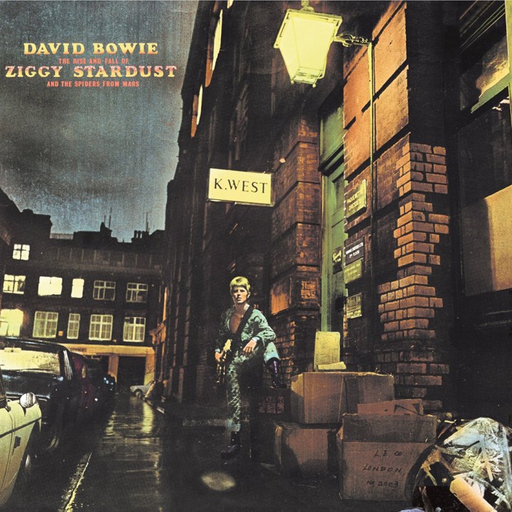
No, Ziggy is not number one. To be honest, if I did decide to do a top 10 of the ten albums I’ve listened to, Ziggy wouldn’t be number one on that list, either (*gasp!*)! However, this album and its cover are both iconic, so it still has a place here. At first I didn’t care for the colorization of the picture. I didn’t think it was really needed, especially given that Mr. Bowie didn’t have that bright blond hair color until 1983. Later I realized the colorization may have been a necessary evil after all, considering that the pic was taken at nighttime. Plus it makes the images stand out more, hence making the picture more memorable. Another cool thing about this cover is that the location of the photo (23 Heddon Street in London) has since become legend, and there’s even been a commemorative plaque placed on the building that once had the “K. West” sign. By the way, this was one of the gems I saw on sale at Manifest last week. Man, I wish I could’ve bought it (I said the album wouldn’t be number one on my list; I didn’t say I didn’t love the album).
6. Station to Station
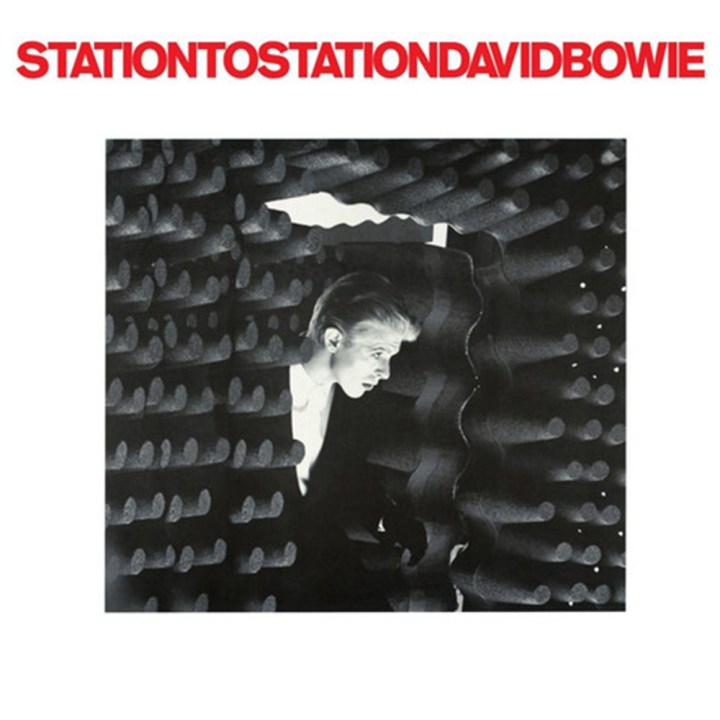 Simply put, I love this cover because it’s a still from Mr. Bowie’s greatest film, and one of my favorite movies, The Man Who Fell to Earth. Let’s not forget, The Thin White Duke is one of my favorite Bowie personas. The album has been re-released in color, but personally, I prefer the black and white version, and they thankfully brought the original cover back when the deluxe album was released back in 2010. To all my fellow Bowie fans out there, if you haven’t listened to this album yet, please do so (this would’ve been number one on my list!)! Sadly, this album was not at Manifest…but it should’ve been.
5. Diamond Dogs
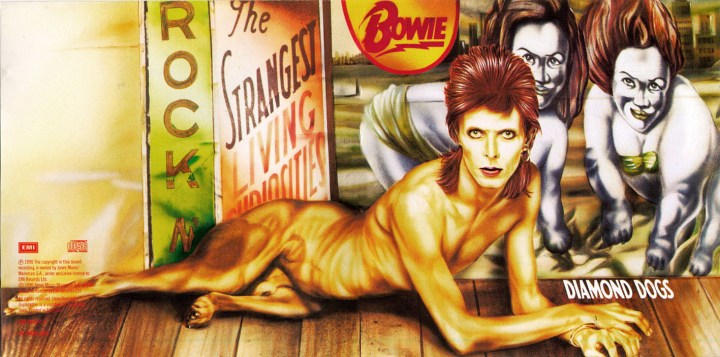
Once again, this is another kickass cover. Between 2009 and 2010, it was the wallpaper for my very first smartphone. It was another gatefold album that opened up to show that Mr. Bowie was a half man, half dog hybrid. Back in 1974, when the album was released in the good ‘ol U.S. of A, this cover caused a lot of controversy—but not because Mr. Bowie had a dog’s lower half. It was because the lower half actually showed the dog’s junk. Wow. Being the puritanical party poops that we are, the U.S. version made sure to cover up the dog’s wee-wee, so the American cover looked like this:
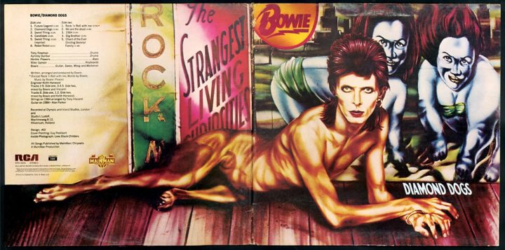
Much better. On a side note, I was walking my dog just yesterday and I caught a view of his junk when he went to mark his territory. Sweet Jesus, my eyes are still burning.
4. Pin Ups
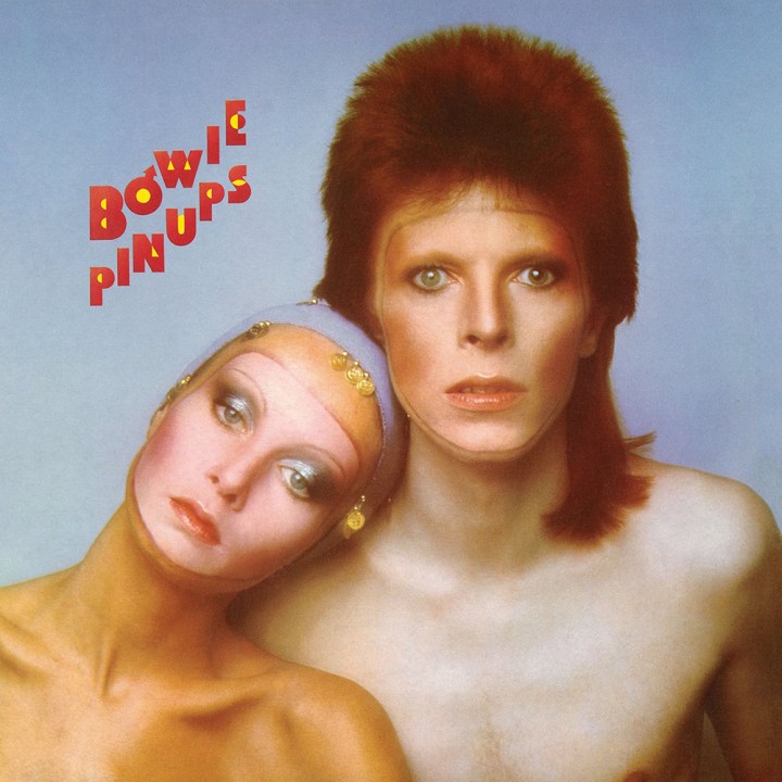
Never listened to the entire Pin Ups album (what did I say about judging me?), but I’ve always loved this cover. The makeup is brilliant. I love how Mr. Bowie and the model both appear as if they’re wearing masks. I also like how they made Mr. Bowie’s face less pale (or at least attempted to) and made the model’s face more pale, although she clearly has a tan. Just in case you’re wondering, the lovely lady in the photo is Twiggy, one of the earliest (if not officially the first) supermodels! Oh yeah, this was another vinyl classic I found at Manifest.
3. The Man Who Sold the World
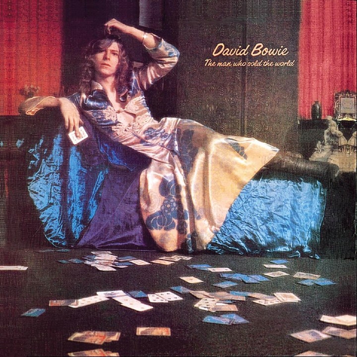
Do you even have to ask why this is on the list? Look at that dress. Only Mr. Bowie could pull off that dress and boots. When asked why he chose to wear a woman’s dress on the cover, Mr. Bowie cheekily told reporters that it was a “man’s dress.” The album itself kicks ass, too. I found this one at Manifest as well, and nearly screamed out loud. It turns out the vinyl version has a cover made out of a sort of canvas material. Very cool.
2. Hunky Dory
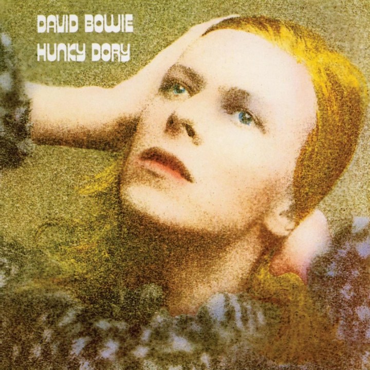
Not only is Hunky Dory one of Mr. Bowie’s best albums (better than Ziggy, I might add), it’s one of his best album covers. He’s just so pretty here, and I welcomed the colorization more here than I did with the Ziggy album. The pose was inspired by the legendary German actress Marlene Dietrich, and the picture was taken by one of Mr. Bowie closest friends, George Underwood. A bit of trivia: George Underwood is also the person responsible for Mr. Bowie having a permanently dilated pupil in his left eye (it gave the appearance of him having a blue eye and a brown eye). The reason is because back in high school, Mr. Bowie stole George’s girlfriend and got a punch in the eye for breaking bro code (George had a ring on when he delivered the strike). Mr. Bowie later thanked him for giving him his signature look. I found this beauty amongst the Manifest bunch, too.
1. Aladdin Sane
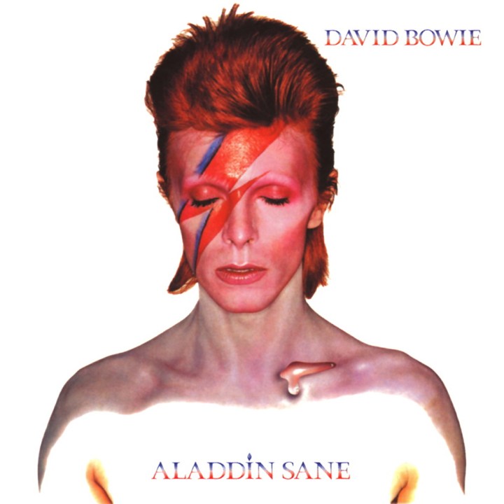
This may be the world’s biggest cliché, but I don’t care. Aladdin Sane is my all time favorite David Bowie album cover. Everything about it is just ethereal and iconic. The makeup, the hair…everything. When I saw this cover for the first time as a young girl, it just stayed with me. Remember when I said Mr. Bowie’s album covers changed pop culture forever? Aladdin Sane did that more than any of Mr. Bowie’s other albums. Whenever someone sees a lightning bolt—especially a red and blue colored one—the first person they think about is David Bowie. When Mr. Bowie passed away, I used this photo as my profile pic on my Facebook page for the next few months. This image from this cover is everywhere: coffee cups, t-shirts, posters, etc. Even Grace Jones and Homer Simpson paid homage to it:


Not only was this baby was in Manifest’s crates too, but they also had an Aladdin Sane poster and a t-shirt for sale. Talk about a girl being in nerd heaven! Man, I really need more money. Can I take up a collection from you guys?
—Written by Nadiya
Do you agree with my list? Which David Bowie album covers do you think are the best? Also, if you’ve listened to more than ten of Mr. Bowie’s albums, which ones do you think are the greatest? Give me your thoughts!
